Sales Analytics
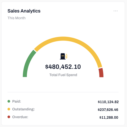
- Data Representation: The widget presents a half pie chart to visually represent the distribution of total spend based on the status of orders. The chart is divided into sections corresponding to paid, outstanding, and overdue orders.
- Color Coding: Each section of the half pie chart is assigned a different color to facilitate easy differentiation. For example, green represents paid orders, yellow for outstanding orders, and red for overdue orders. This color scheme allows users to quickly identify the status of their spend.
- Data Labels: Each section of the half pie chart is accompanied by data labels displaying the dollar values of the respective spend category. This provides users with a clear representation of the proportion of spend attributed to each order status.
- Time Period Selection: Users can choose the time period for which they want to analyze the total fuel spend values. This allows them to focus on a specific period and assess the changes in order statuses over time.
- Real-time Updates: The sales analytics widget updates dynamically as new orders are processed, payments are made, or order statuses change. This ensures that users have the most up-to-date information and accurate representation of their sales revenue status.